


Build Business with Charts and Graphs on Invoices
There’s nothing like a bar chart or a line graph to perk up a presentation. When it comes to invoices, using charts and graphs can help streamline the billing process by providing an easy-to-understand overview of costs and other details. A colorful pie chart that shows a customer how their $40 utility bill breaks down among service, taxes and fees and fuel is sure to catch their eye.
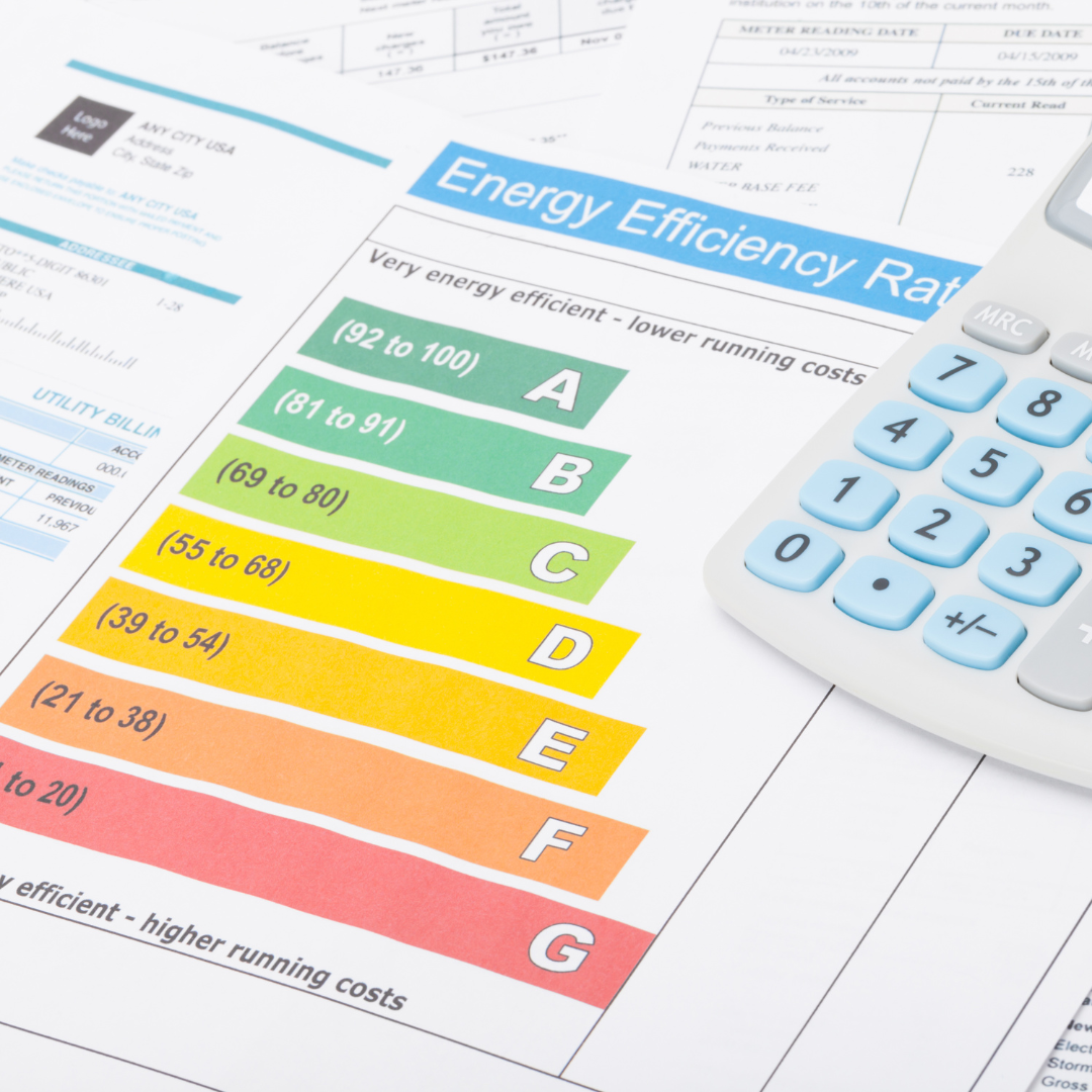
Charts, graphs, and other visual representations make it easier for our brains to digest data and grasp complex information. They help us see how different factors relate to one another.
They can be used to great effect in utility company bills. An electric utility might use a bar chart to illustrate a customer’s residential electric use, month by month, comparing this year to last year. A water company might use a line chart to show how a dry spell causes water use to take a steep climb in the summer months. Generally, visuals can make billing more efficient, reduce errors, improve accuracy, provide better customer service experiences, and increase overall profitability for your business.
The upsides of adding charts and graphs to invoices
Graphics make your invoice look more appealing
Invoices are an important part of any successful company, but there’s no denying that they can sometimes be a bit boring. So, sending an invoice that provides additional information, in a manner that is easy to absorb, is a little more appealing. It also conveys that a company believes in sharing information and values good communication.
Additionally, the graphic element doesn’t always have to be a chart. For example, a water company could print a water droplet graphic on each bill and print the number of gallons of water the customer had used that month inside the droplet. Any visual representation will add interest.
Better communication could equal fewer calls for clarifications
Utility bills fluctuate. Charts and graphs make it easy for customers to notice the ups and downs. For example, by looking at a chart that shows the average temperature and electric usage for each month, a customer would quickly realize that January’s bill has increased significantly because the average temperature that month was 20 degrees lower than December.
A graph or chart might alert a customer to a problem
A water leak can go undetected for some time. So can a slow leak in a toilet. A chart or graph that shows a drastic leap in usage can tip off a homeowner to a problem with their pipes or plumbing. The same goes for other utilities. Changes in use sometimes signal service problems.
A chart or graph might nudge a customer to ask a utility for ideas and advice
A chart or graph that shows a drastic rise in utility use might convince a customer to sign up for home inspections or other programs that utilities have developed to help customers improve energy efficiency and resource use.
Tips to help you effectively use charts and graphs
Choose the graphic to fit the data
The type of information being shared drives the choice of graphic. The three graphics most commonly used in utility bills are line graphs, bar charts, and pie charts. Line graphs excel at showing how something — water use, for example — changes over a period of time. Bar charts illustrate quantity or numeric value. A pie chart presents different parts of a whole. Those are some good recommendations to follow. The last thing you want to do is use a graphic that leads to confusion.
Design guidance for charts and graphs
Good design principles are key to the effectiveness of a chart or graph. Here are a few tips for better graphics.
Stick to a color palette
It is important to stick to a specific color palette to create consistency in the visuals, making them easier to read and understand. It also allows customers to quickly identify key information and spot trends or patterns more easily. You don’t want to use colors that are on opposite sides of the color wheel because the contrast can be distracting.

Red means hot, blue means cold
This is where the contrasting color advice goes out the window. Color can communicate a mood or feeling. Warm colors like orange and red remind us of the sun and indicate warmth while cool colors, like blue, relay a feeling of coolness and calm. Another time colors are used to communicate differentiation is when discussing politics as it is widely known that red represents the republican party and blue represents the democratic party.
Typeface and size impact readability
The written descriptions or labels on a chart tell us what the bars or lines represent. Descriptions that are short and printed in easy-to-read typefaces help make the chart or graph easy to understand. Readers will appreciate a type size that is large enough to be easily read. Horizontal labels are also a plus so that people don’t have to turn their heads to read them.
Solid lines are easier to follow
Dotted lines are sometimes used in graphs, but they can be hard to follow. Solid lines in different colors are easier to distinguish.
Simplicity rules in graphics too
Graphs and charts sometimes try to communicate too much. For example, a pie chart that’s divided into a dozen pieces or a line chart with 8 or 9 different lines is hard to visually engage. Some experts recommend keeping a pie chart to 6 or fewer pieces and a line graph to four or fewer lines. Instead of packing a lot of different information into one graphic, many utilities present a series of different graphics to relay different information. For example, a line chart showing energy use for this year compared to last or a pie chart showing the breakdown of what percentage of a home’s energy is being used by lighting, appliances, computers, and heating/cooling.
If you’d like to know more about how to make your utility bills more engaging and informative by adding charts, graphs, and other visual representations, give us a call. We handle the design, printing, and mailing of utility bills for dozens of utility companies. We always look for ways to help these clients improve outcomes–to speed up customer payments, increase rates of payment and improve communication through invoices that are more visually appealing and interesting as well as easier to understand.
Interested in how Bluegrass can help?
See what we can do.
You may also like...